 |
| Design Set 1 |
 |
| Design Set 2 |
 |
| Design Set 3 |
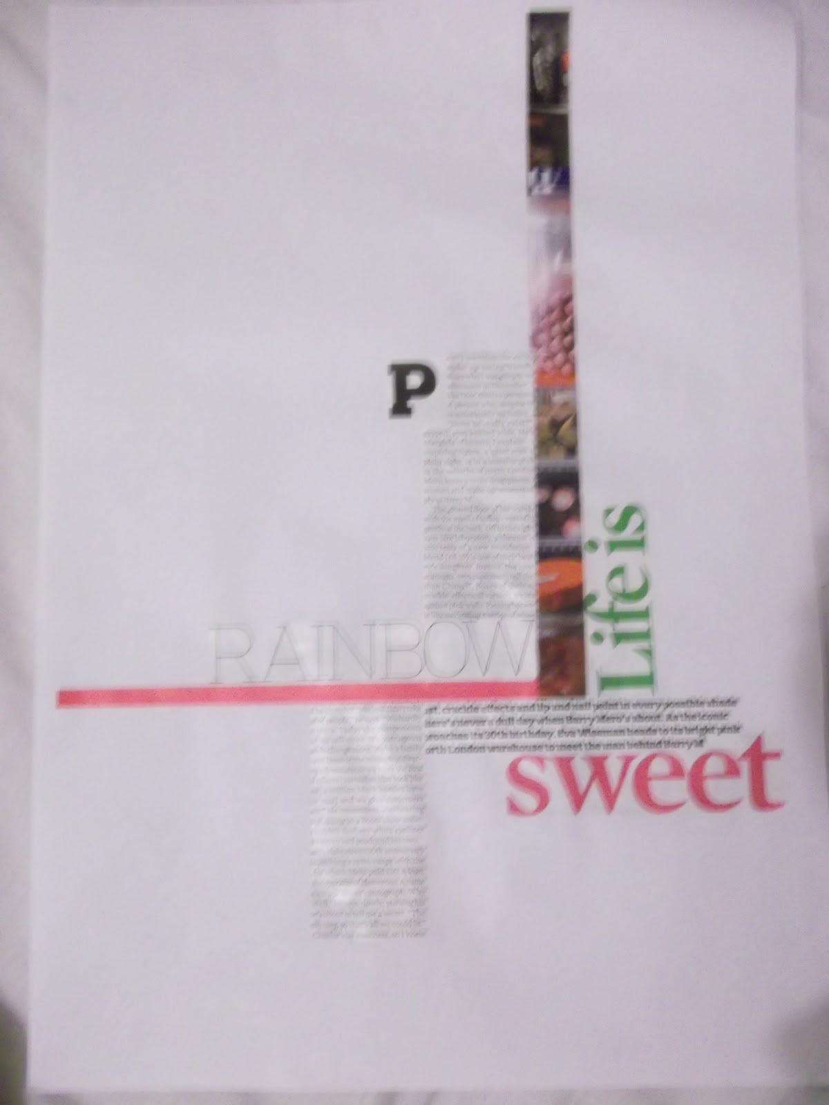
I then moved on to creating A3 layouts using a specific grid, I found this task to be more challenging, as the grid restricted some of the ideas I had. I quite enjoyed this short task as it really got my mind thinking about good composition and making effective choices in relation to allignment and typeface.
ARKITEKT MAGAZINE
 |
| Thumbnails for victorian architecture. I experimented with different layouts and compositions for individual articles so that i can piece them together to create my double page spread. |
 |
| Thumbnails for Wolverhampton Parks |
 |
| Thumbnails for Student Housing |
 |
| design for my double page spread |
 |
| Thumbnails for my front cover |
 |
| Black and white printout of the front cover - will be trimmed down with smaller borders. |