 |
An early version of my introductory double page spread, i like the layout of the left-hand page but i do not like the placement of the column on the right-hand page, as it doesn't align well with the rest of the design. |
 |
My own illustartion for the front cover: Although it doesn't have much relevance to the zine, i wanted to empasise that the 'zine' has been produced by students in the School of Art and Design. I feel that it makes the cover more creative and it may also make the reader more inquisitive to the content of the zine. |


 |
| The final designs for my zine. |
Thumbnails and visuals:
I have produced many thumbnails detailing my ideas for the 'zine' project. I found using thumbnails and visuals helpful as when working on screen i could produce some effective layouts. Here are some examples of the work i have produced leading up to my final designs:


 |
Some visuals for the introductory 'Hello and Welcome' double page spread. I was trying to visualise how to arrange the body text into columns and fit them arrand the heading. I was also experimenting with how to incorporate images into the spread. |
 |
| Thumbnails for the front cover: showing various layouts and how to arrange the image and heading. |
 |
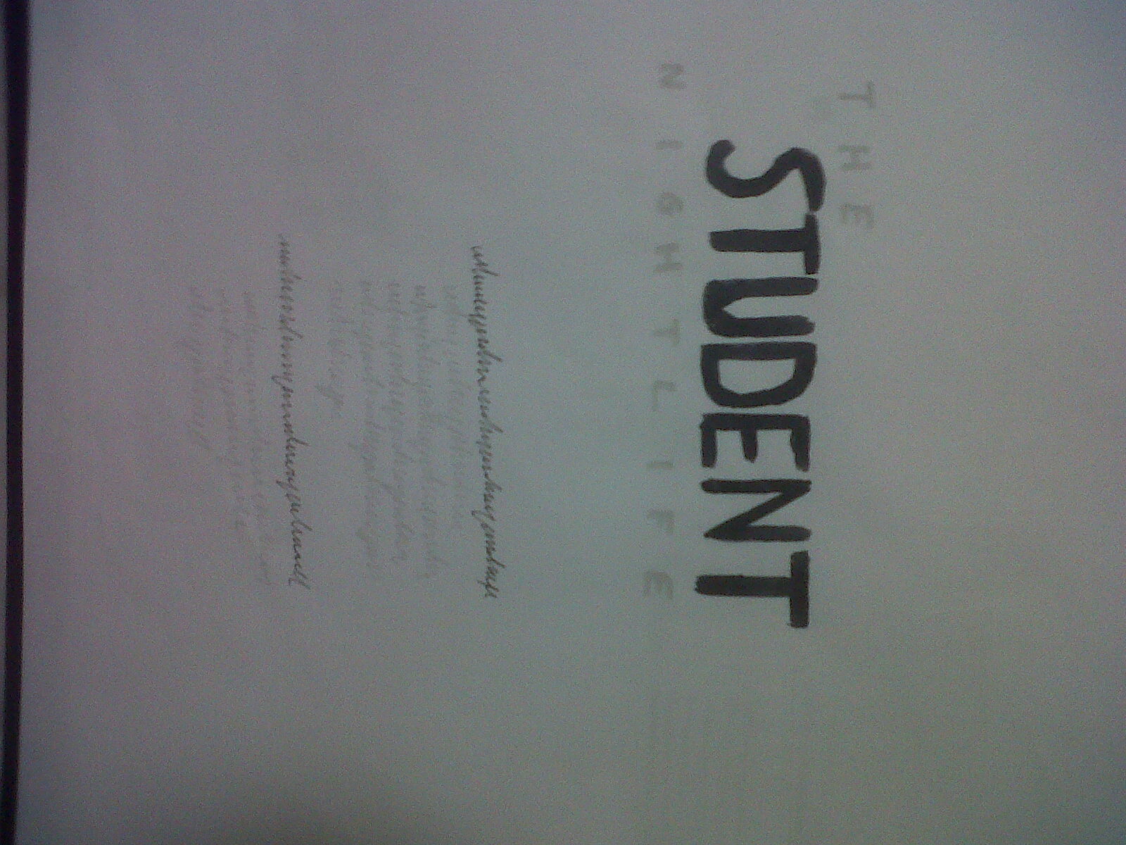
A pen drawing i did for the front cover (which i have explained above) I really like this illustration and i feel that it emphasises other qualities other than design. |


Hopefully you can see what i've been doing in my layouts, as my camera has decided to break I'm trying to use my phone - which has no flash :(. I have been working out various double spread layouts, using different combinations of serif and non-serif typefaces, and different placements of headings and text-bodies.
Some more initial design ideas:

Wrong way round! These are some of my initial ideas about paragraph and heading styles.
No comments:
Post a Comment